Hello and Welcome to my A-Level Media Blog. My Name is Vivian Oparah [0621]. On this project, I have been in Group 5 and worked with Louis Caldwell [0131], Sebastian Hodge [0330] and Joshua Brooks [0110]. To navigate around my blog, you can click any of the headings under the 'Labels' subtitle on the side of the page - this will filter posts into the various stages of the project.
At the bottom of the page, there is a link which takes you to 'Older Posts' which can be clicked on as well.
Thank you for reading and I hope you enjoy my blog!

"NTLS - Heart Skipped A Beat" Music Video


Our Music Video

NTLS Self-Titled Digipak Cover

NTLS Self-Titled Digipak Cover

NTLS Website

NTLS Website
Right-click the image and select "Open link in new tab" as this will take you to the official NTLS site

Friday 19 December 2014

Album Cover: Development


Finally, we had put together everything we had for the album cover and made a front cover graphic which we liked and which we felt created a very strong band image.

The only thing that needed changing was me on my own on the inside cover as it emphasised me more than Josh. Our teacher also suggested adding features to the back which increased opportunities of audience interactivity, however apart from that, we were done.

Website: Final Development 3

As we had completed our On Location Promo shoot, we were able to replace the stock background image on the website with one we had taken and edited on Photoshop.

Background shot from Promo Shoot
After we placed this image, we realised the logo we created was no longer visible. To combat this, we white airbrushed the top left hand corner of the image before we layered the logo to ensure it stood out whilst staying in a fixed position if someone was scrolling.

Next, we used the completed merged face graphic and added that to the homepage, adding a click-able link which would take the viewer to the album cover and so making the page overall more attractive.

Homepage with Graphic
We thought it was important to offer the audience all the information about the artist on the website without having to Google Search or look on Twitter, so we added a tour dates page. This showed a list of date, venues when and where they were playing - with an interactive link to Ticketmaster, to make purchasing the ticket easier. To liven up the page we added a picture of the artist, with a link to their live twitter feed to strengthen the link between audience and artist. 

Tour dates page

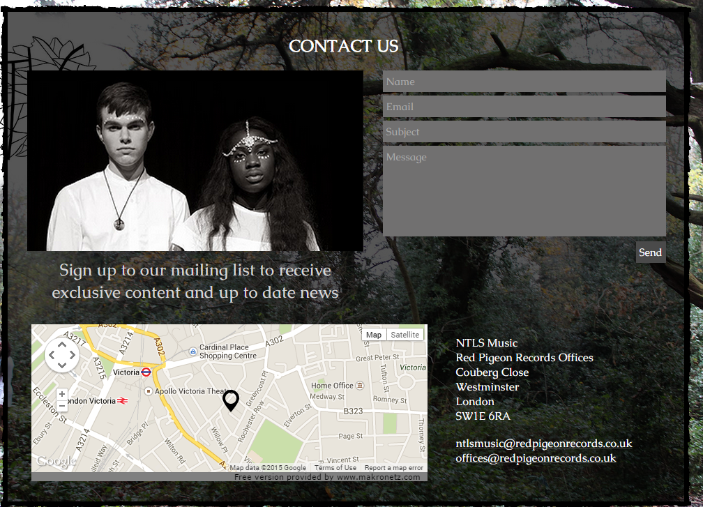
For the final part of our website, we wanted to ensure that there was always a means of staying connected with the artist- so we added the Contact page for any enquires or just personal messages. We thought this would be the ideal page to add some information about Red Pigeon Records, to show where to find them and just to give them some credit in general.

Contact us page
This is a final walkthrough of the completed site:

Album Cover: Further Developments

Initially, the dotted graphic wasn't working so we just placed the NTLS logo on the front cover and started to make the rest of the album.
We didn't ever have time to take the lightscribing picture, so we had to edit some of the promo shots we took and use them instead.

The only issue with using the promo shots on the inside was that we did had intended to have a black on white and white on black image of the artists, except couldn't find a good enough image with both of the artists on the white background, so instead went for on of Vivian on her own. The issue with this was that it was confusing for people to see the female artist on her own, due to how the image had been created for all other aspects of the project.

Album Cover: Developments

We had various components for the album cover which we decided would best be made individually


The image on the left is the main graphic and was easiest to make on PhotoShop because it was made of quite a few layers.
Getting the ratio of face was crucial so it didn't make one artist look more important than the other.


We all decided on the idea of NTLS written within a leaf and so Josh drew it up. The image on the left was produced after a drawing was scanned in and edited on Adobe Illustrator. The black areas of the image were isolated and the edges of the original drawing were neated using a pen tool to thicken certain lines


With these components completed it was a lot easier to proceed into making the rest of the album.

Website: Second Developments

We started to look a bit further into the layout of the website.

The 1975 had a really cool way of laying out their social media links so we tried to apply this to our own site, however we chose to use the square icon design instead of the circular one and white icons instead of black as they will stand out more against the forest background.


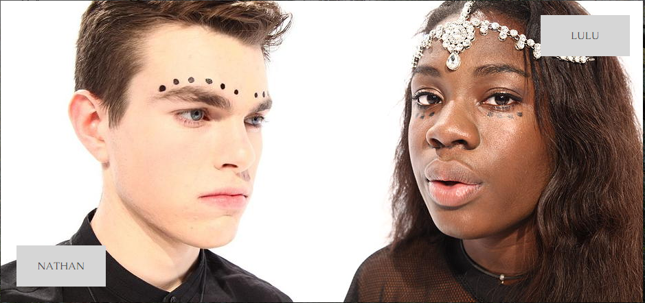
With some of the pictures from the promo shoot, we decided to create the 'About' page for the artists. We inserted buttons with the artists name on them next to the pictures of them. This lead to a page with a short bio for each of them which I wrote and a link to the twitter feed to allow the audience to keep up with the artist and use the website more interactively.


Thursday 18 December 2014

Post Production: Editing

To make the editing process a lot faster for the rest of the group, Josh decided to sync all the videos to the edited track to make clips a lot easier to drag onto the editing timeline for the final product. We were really lucky that Josh did this as it meant the entire editing process was a lot smoother and more efficient.

Synced Videos
Working to the strengths of the group as mentioned before, Josh and I mainly took charge of the editing, however we consulted Louis and Seb before making any big decisions which would heavily affect the look of the video.

We used alternative layers, this was useful because:
  • It made rearranging shots easier
  • It made it clearer that the shots were linked
  • It made it easier to alter cut away points for each shot
Carol Vernallis heavily influenced our editing technique. Our cut away points were heavily controlled by the beats in the song, referencing her theory of editing and also her ideas on creating a relationship between the lyrics and the video. Also we loved her idea of challenging the audiences expectations so we changed from black on white to white on black shots frequently - this was also effective for us as it added another dimension to our simplistic idea.


Other ways we challenged the audiences expectations through our editing was through graphic matches, defying the 30 degree rule and extreme pace changes in our editing:


Originally, we wanted a continuous studio sequence, which you can still see elements of (e.g. the head turns) however this started to become dull and without some footage was proving hard to do so we scrapped that form of editing for the studio. This was quite risky but we had such a strong vision of how our music video should be that it didn't pose too much of a threat.

A main problem we faced was when we wanted static studio shots, but subtle things like blinking out of time or fidgeting ruined this. This was mainly for establishing shots. So, to combat this we slowed the footage down to 70% or half speed so these movements wouldn't be detected. We also had to speed up some of the blinking shots so that they would be precisely on the beat

Changing shot speed
Overall, the edit was not too difficult. I am glad it was one of my main focus out of all 3 artifacts because I feel I am quite strong creatively but I also learnt a lot.

Saturday 13 December 2014

On Location Promotional Shoot - Final

To avoid the problems of the last shoot, we left at midday which allowed to set up and do the shoot before it became dark. This meant that we didn't have to use an external flash. We also decided not to use a tripod as it felt quite restricting. 

The images from this shoot were exactly what we wanted and perfect for use on the album cover and website.

Friday 12 December 2014

Group Dynamic

Personally, I think our group  is working wonderfully together. We all bring different things to the table and make up where each other lack so across the group we have quite a strong skill set.

Moving forward into post-production, we decided to split the tasks to maximise time and work to the strengths of the group.

Music Video Edit:We decided it was best if Josh and I edited the music video. This was the most amount of work so it was necessary if two of us were assigned to complete it. Josh is very skilled with editing and so we can benefit from that aspect. I am quite good at editing but I mostly very creative and have a good 'eye' for what looks good which the group trust a lot, so they can rely on me to decide which shots go where.

Seb and I also have a lot of frees together so he will be feeding into this aspect aswell. Seb is very pragmatic which will be useful if I get worked up about something going wrong in the edit. He is also good at editing so can take over.

Album Cover:
Louis recreationally uses PhotoShop so is very skilled on it, with the group deciding together on what we wanted the album cover to look like, Louis would find it really easy to recreate our ideas on PhotoShop. He is very creative and practical so this was ideal for him.

Josh is also quite good on PhotoShop sometimes they would work collaboratively on the album cover.

Website:
Seb is an incredibly fast learner and is also very creative, so using Wix was fine for him, especially after the group mapped out together what each page of the site would look like.

Louis and I who are both quite creative also fed into the creation of certain pages.

This is just a format for who was mainly responsible for doing what, but truly we all fed into each others work and were constantly asking each other for advice and feedback so each artefact remains a group effort.

Weekly afterschool meetings allowed us to map out where we were at with everything and what needed to be done going forward/ Although our group could sometimes have what would appear to be a laid-back attitude, we always remained on task. To improve, we need to communicate more with our teachers so we can constantly get feedback on how to improve our own work.

Post-production: Grading


Grading our music video was probably one of the hardest parts of the entire project for a variety of reasons. 

Shots like these:
Before Grading
After grading
Were quite easy to grade as there wasn't much to change. The brightness needed to be slightly decreased, the contrast increased to strengthen the difference in black and white and the saturation increased slightly to make certain colours look nicer.

This was achieved with the Procamp tool:
ProCamp
When things were slightly more challenging like with these shots:

Before Graduing

After grading
We used the ThreeWay Colour Corrector, to add bring out more in the skin and the eyes without making them look over saturated

Three Way Colour Corrector
Usually, with the VHS shots, it was just a matter of making them slightly more saturated to bring out the colours more, but changes made were hardly noticeable:

Before Grading

After Grading
The main problems were with shots where the exposure on the camera was too high, making them very white. The grading tools on PremierePro were unable to isolate colours, so the background kept changing colour with the subject staying the same. So, we had to open the shot in After Effects to be able to isolate specific colours


 The Colour Finesse 3 interface was really complex but after getting the hang of it and becoming familiar with the sliders, it wasn't too tricky to use.

Before

After
With problems like this it was difficult to achieve a consistent grade, but after a lot of work and attention to detail, we managed to do so. 

On Location Promotional Shoot - Planning

Firstly, to allow us to prepare for the real shoot, we got into our costumes and went to some areas of forestry near school to get a few test shots and see if our ideas for the website and album cover were feasible.

Practice shots taken
The next thing we did to plan the actual shoot was not intentional. We were on our way to 'Grovelands Park' in Southgate intending to do the actual  promo shoot, however it started to get dark and we knew this would affect the quality of our images. As a result, we decided to use a local park we came across on our journey to Grovelands which was a lot closer to our school.

However, by the time we had set up in the local park, it was dark. Anticipating darkness, we were equip with the external flash which we used and we also tried to change the shutter speed but after uploading the pictures we realised the flash made no difference and changing the shutter speed was futile as the camera could not be held still enough to get a sharp image.


We tried to edit some of the photos on Adobe Photoshop but majority were too dark to brighten without distorting the grain of the image. None of the shots met the standard we were trying to achieve for our album cover and website so we decided to scrap this shoot and use it as a learning experience.

For the actual shoot we will ensure:

  • We go as early as possible to erase any possibility of it getting dark during or before the shoot
  • We check the weather (as it started to rain) and try avoid any obstructions as much as possible
  • We stick with the all white costumes as the black and white isn't as striking

Monday 1 December 2014

VHS Narrative Shoots and Reviews

In order to capture the stages of the relationship, we did 3 main shoots:

  1. Alexandra Palace & Louis' House
  2. Brick Lane & China Town
  3. Tower Bridge & Ginas House 
Before these main shoots, we also got some test footage at a party and during the half term, Louis and Gina went to Paris and recorded some potential footage.

Alexandra Palace & Louis' House
For this shoot we wanted to get some casual relationship footage, mainly shots of Louis and Gina:
- Walking with Alexandra Palace in the background
- Kissing
- Laughing and Messing around

The shoot:
We started the shoot at 10am as the footfall for Alexandra Palace at that time is low, with only dog-walkers and runners around. This meant we wouldn't disrupt their activities and for us, we were less likely to have footage where members of the public were breaking the fourth wall out of curiosity. The shoot ran smoothly and we were able to get a lot of footage on the VHS whilst also recording on the HD camera to avoid any cross over.

After this, we went to Louis' house to shoot some more casual, intimate footage.  We had some issues with the lighting in his room because we wanted it to look like night time, however when we shut the blinds the quality on the vhs decreased/ To combat this we were just quite selective with which blinds we shut and which lights we turned off.

Overall it was a good shoot.

Footage Review:
Looking back on the footage, we were happy with what we got. We kept the camera rolling on the shoot which meant we had a lot of footage to look through but on the plus side we did capture some very sweet moments. We noticed some of the footage had dates, but when we zoomed in to get rid of the black borders, the dates disappeared so wasn't a problem.

Alexandra Palace
Louis House
Brick Lane & China Town
The Shoot:
In order to make Gina and Louis characters that our target audience would identify with, we had to make them look quite alternative. We thought vintage shopping in East London matched that well and so we went around Spitalfields Market, filming them interacting with the different stalls and shops. We recorded again on both VHS and HD

The route we took around East London

When we were on our way to China Town we had some time to look over the footage we already recorded. We realised it was starting to look a bit similar (lots of shots of them walking from behind) so we noted to change this when we got to China Town.
Instead, we got them browsing, helping each other and being silly which was naturalistic and interesting.

Footage Review:
Looking back over the whole day we got a total of 12 minutes nice footage, which was also really cute. There were 4 different costumes across the footage which was helpful as we were trying to add longevity to the relationship.
If we were to improve the footage, we thought we needed to continue experimenting with them doing other things aside from walking, and to try and stabilise the camera as some of the shots looked quite shaky.

Brick Lane

China Town
Tower Bridge & Gina's House
The footage from this shoot was going to be the breakdown of the relationship and the actual breakup. This meant at Tower Bridge we had to subtly show changes in the relationship and then at Gina's House have quite an explosive ending.

The Shoot:
The shoot was quite difficult as Louis and Gina had to act quite distant from each other and whenever Me, Seb or Josh were filming, we had to ensure we captured small moments that indicated things were no longer the same. We started the shoot at London Bridge and made our way along the riverside, down to Tower Bridge; The direction we gave them which was easiest for them to relate to was 'Act like you've just had an argument' this allowed for moments of happiness but overall despondence from both of them.

The Footage:
Due to issues with the lighting, a lot of the footage was unusable. Also, when we resized the footage to remove the dates, it made some of the shots appear really badly framed, so another batch was unusable. Luckily, it was clear throughout the whole scene that they were unhappy so anything we could salvage was useful because their acting was never an issue.


Gina's house
The shoot at Ginas house for the breakup was quite easy. We always ensured Gina was reacting to Louis either by shouting or throwing clothes at him to make it clear he was breaking up with her. The footage we got was decent with it following a basic narrative flow. Unfortunately, footage was unusable as the acting wasn't entirely convincing, but enough of it was convincing enough to make a roughly continuous break-up sequence.

Although it was a lot of hard work. I'm glad we dedicated as much time and effort to the narrative section as we did with the studio footage. Overall, it looks really good together and adds to the style of the video.

Here is a short compilation of what we shot across all shoots, with some of the party and Paris footage: